Sale on canvas prints! Use code ABCXYZ at checkout for a special discount!

Boundary: Bleed area may not be visible.


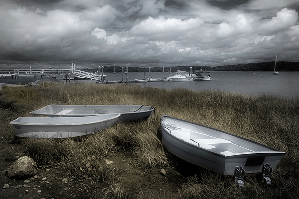
by Glenn DiPaola
$25.00
Size
Bottom Style
Image Size
Product Details
Dress it up, dress it down, or use it to stay organized while you're on the go. Our zip pouches can do it all. They're crafted with 100% poly-poplin fabric, double-stitched at the seams for extra durability, and include a durable metal zipper for securing your valuables.
Our zip pouches are available in three different sizes and with two different bottom styles: regular and t-bottom.
Design Details
This is a typical water front scene from Bristol, Rhode Island. Bristol is a peninsula, which give the town a lot of different bodies of water,... more
Care Instructions
Spot clean or dry clean only.
Ships Within
2 - 3 business days
This is a typical water front scene from Bristol, Rhode Island. Bristol is a peninsula, which give the town a lot of different bodies of water, including a few bays, a harbor and what you see here – the Kickemuit River, which is on the east side of town.
I usually process my images to show what I saw and was thinking when I took the photo, but I experimented with this image and had some unexpected, but welcome, results with a technique I had not tried before.
There is also a black and white version of this image on this site, titled Low Tide.
I attended the University of Rhode Island where I studied photography under Bart Parker. I graduated with a BFA in fine art photography and a minor in communications. College was always b&w work, hand-processed in the dark room, using many different cameras. It was great fun. After college I worked in the photo-finishing business for many years as well as doing commercial photography. In the 80's I started to shoot only color for my artwork and never returned to the world of black & white - until 2014. I started converting my color digital images to black and white whenever I saw them as intended for bw. I believe the eye you started with does not go away. With my newest Fujifilm digital cameras, I am shooting for b&w and...
$25.00


Connie Handscomb
This is stellar, Glenn. I love the scene … how the soft, dusty gold highlights the muted grey tones; provides an elegance & timelessness to the image. And the boats connect in Friendship, towards each other — nice! The grey boats — another highlight to the depth of those marvelous Big Clouds ; a great image , any way it’s processed ;))
Glenn DiPaola replied:
Thanks very much for yourt insightful words. This is the type of shore I grew up with. Not the sandy beaches many people go to. There is a lot going on with them. The idea of Friendship among the boats is great. It does look like they are having a nice talk, wishing for whatever boats would wish for. I had a lot of fun with the tones in this one. Until you start in on it you don't know exactly what is possible. It is one of my favorites from this trip home.
Linda Lees
I used to do darkroom work too Glenn. I specialised in black and white infrared film. I had to use a dark bag to get it in and out of the camera. I love the effect of infrared film, so dreamy. Unfortunately they don’t scan well for uploading to sites like this. I have uploaded a couple, but there’s nothing like seeing them in person. I agree, with you about the advantages of digital, and another bonus is not breathing in all those chemicals. But I do miss the magic of seeing the image appear in the developing tray.
Glenn DiPaola replied:
It was magic when the image started to appear. Printing was time enjoyed. Developing film, less enjoyable but a sigh of relief when you saw the negatives did come out. I worked in photofinishing for years. The chemical waste always bothered me. I am almost done scanning my BW negs from college and a little beyond that. I'm sending some to college friends during the holidays so they can take a trip down memory lane.
Linda Lees
Great processing Glenn, your use of desaturated colors draws my attention to those magnificent clouds as well as the boats, which look kind of metallic. As much as I like this one, I think the black and white version is my favourite, I'm a big fan of black and white! L/F
Glenn DiPaola replied:
Thanks very much Linda. I'm glad you commented on this one instead of the BW. This was a happy accident of sorts. It was converted to BW but then I used the color sliders in Lightroom and the color started appearing in muted tones. I worked the grass and sky before doing local masking with the boats and other objects. I think I did about 5 versions of this. It's my home town, so it something I don't mind spending time with. I share your feelings about BW. I started with BW and it was years before I started shooting color. One of the great things for me about digital is that I can do both and I have far more control than I ever had in a darkroom. Thanks again.
Kathy M Krause
What an capture Glenn! Love that your experiment worked out well! L/F
Glenn DiPaola replied:
Thanks very much Kathy. I didn't know the grasses would have this result. It looks like fall, which is my favorite season - and grasses are a favorite sight for me. Win-win.